UK
UK FR
FR
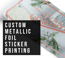
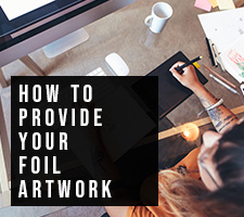

How To Provide Your Artwork For Foil Print
Set Your Files Up Correctly For A Perfect Finish
Creating amazing metallic foil print means making sure your finished artwork is high quality and correctly set up. In this blog, we'll try to explain the best way to set up your artwork and suggest things that you'll need to check and avoid so the flow from purchase to print is streamlined.
To make this blog easier to understand you can download the example foiling file PDF which we've used throughout the content. This should make following along simple.

The Finished Product
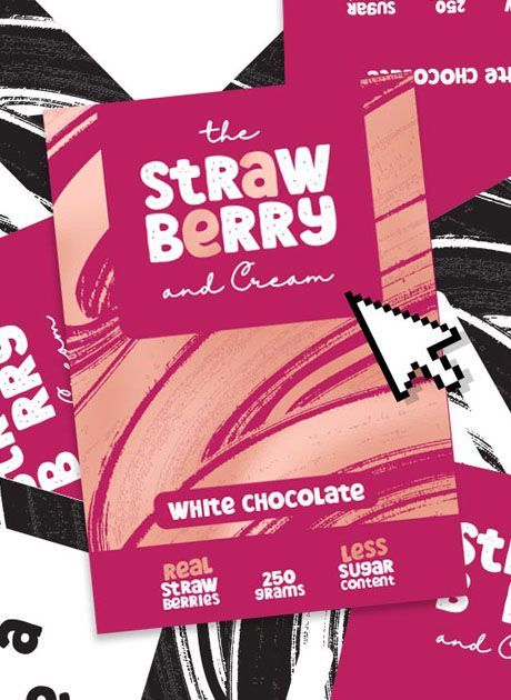
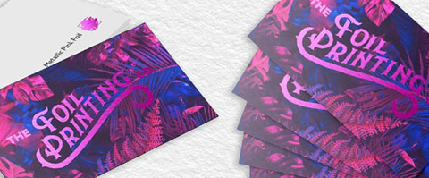
Don't worry, the tips are coming, but here's a finished photo of the example we'll be using. Take note that in this example we're using color print and foil together to create some lovely highlights but still keep the business card readable. If you're only having foil and no other print, you can just supply your design in 100% black.
Understanding The Basics
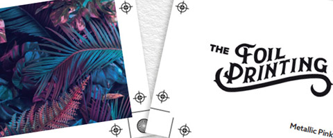
The first thing to grasp is that the foil is printed separately to everything else. It is either the first or final step in the printing process as the foil layer will always sit on top of everything else.
So in the example above, which is single-sided, the color print in the middle will be laid onto the paper first, and then that print will be sealed off with a laminate (foil sticks to bare toner so we need to cover up the bits that don't want to be foiled). The next step is the precursor to foil which involves printing everything for foiling in 100% black which you can see on the right (0% Cyan, 0% Magenta, 0% Yellow, 100% Black). Once we print this layer, it's time to run it through the foil laminator which heats both the black toner and foil to over 100°C and fuzes it with pressurized rollers to foil pigments on a carrier roll. We have a blog post all about how foil printing works if you're interested.
Movement In Our Printer
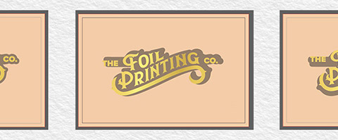
No matter the machine or process used for foiling, from us or anyone else, there will always be a movement for where the metallic foil can land. Micro-movement is an attribute that is unavoidable and should be taken into consideration when designing your artwork. Our tolerance is 1mm out in any direction. The cause is due to the paper moving around in our printers. For most people's artwork, this won't be an issue, and you'd find it hard to notice, but on some very intricate designs, it can mean we have to come back to you and suggest some tweaks to make it printable. You can see our example above which illustrates two scenarios of the foil landing 1mm out in different directions.
Some Key Factors to Consider...
Before going ahead with your order, you will need to consider the points below. Bearing the following in mind and taking the correct steps will result in you getting the absolute best print possible. Remember that our customer service and design team is only a phonecall away if you have any further questions or require some design assistance with your order.
Splitting Your Artwork
Creating separate artboards is crucial for foil printing, it creates clear instructions for what is to be foiled and what is for print. We call these the foil layer and print layer. If you only have a single-sided print, you can expect to have one of each. If your print is double-sided, then we'd usually expect four artboards which consist of the front foil layer, front print layer, back foil layer and back print layer. If you're having double-sided print but only have one side foiled, then you should omit the foil layer from the side you're not having foil printed to.
We Always Print In CMYK
One common mistake we often come across is that people sometimes supply their artwork in RGB. It is impossible to print in the RGB format, and it's worth noting that when converting to CMYK, some RGB colors look different. That's why when you first start designing your artwork it's always best to start and finish in CMYK for consistency's sake. We can convert it on our end but can't guarantee the colors will be 100% the same tone.
Foil Print and Pantones
Similar to RGB, we also can't print Pantone colors you've chosen off your computer monitor. This is because all monitors are calibrated differently.
If you happen to have a Pantone booklet and pick a color from there. We can create a CMYK makeup that will be very close to it, but not 100%.
One thing to keep in mind is when we laminate for foiling, the layer can darken the shade of your print, so you could say this defeats the point of using a Pantone color, to begin with.
A good rule of thumb is to supply your artwork a little brighter than you want it, especially photos or darker images.
Other Settings For Your Foil Artwork
Although the most important step to foiled artwork is splitting out your layers, there are still some other guidelines we need to make you aware of:
#1 - make sure to add 2mm of bleed around the edge of your design if the print bleeds off the edge.
#2 - Design your artwork at 300 DPI for the best quality.
#3 - Provide your design as a vector for the smoothest output (will also take bitmap however this can produce jagged edges on foil).
#4 - It's always best to be supplied as PDF since all your images and fonts will be embedded. If this isn't possible, an embedded AI is also suitable. But do get in touch if you're not sure.
And there we have it, if you're wanting to order anything from stunning silver certificates to foil greeting cards and glitzy gift tags, follow this guide and you can be sure you will receive the best foil print products that are possible.